LK James Covers Books:
An Interview with the Artist and the Admirer
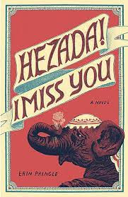
Erin Pringle here. When my novel Hezada! I Miss You (AWST 2020) was in process to publication, I was introduced to the person who would create the cover art. I have as much trepidation about my books' covers as most writers, but luckily, LK James was LK James, which I learned to mean that she is fantastic. Not only had LK had read the book, but she also wanted to know what sorts of images I thought of in relation to the cover. We brainstormed, shared, and soon after, she sent me an early draft of what became the cover. I love the cover. Daresay, I love everything about the cover. From the way it fits the novel itself--to the border pattern--to the Queen Anne's Lace in the elephant's trunk. The elephant itself. The lettering. The colors.
All.
Of.
It.
After AWST decided to publish my next book, Unexpected Weather Events, I immediately requested that LK design the cover. Even though she no longer did the press's covers, they reached out with my request, and thankfully she said she would. Later I realized that she not only did the cover but also formatted the book for the Advanced Reader Copies. Discerning Readers might notice that the inside chapter headings are the same typeface and style as those in Hezada! (I find this to be a lovely perfect secret in plain sight.)
Soon after she agreed, she read the stories, and said she had a good idea for the cover.

.jpg)
Not long after, I decided that LK and I needed to talk about art--her art. Thankfully, she agreed, and what follows is an email exchange of my questions and her answers.
🕮
Erin: Do you spend more time sketching in a journal or on the computer? What's the relationship between the two for you?
LK: I keep two sketchbooks: one is a warm-up/catch-all kind of place where I work out ideas and generate imagery, the other is more like a diary focused on daily observations of my life which I started right before I had a baby. Some of these sketches migrate to the computer (or tablet) where I will edit, refine, or add color. I draw on a tablet most often when I'm traveling or away from home. I love the versatility and efficiency of digital drawing when testing out ideas for printmaking, you can experiment with different color overlays with great effect. Often I move back and forth between analogue and digital, depending on the project, but usually things start on paper on my table, move through a digital process, then are spit back out through some kind of printmaking process.
Erin: I grew up choosing books by their covers and the first few sentences. I was forever disappointed by the dissonance between the cover and the book content, and I had a grave suspicion that the cover artists never read the book. But then, when you designed the cover for Hezada! you'd read it, and that surprised me in the most pleasing way. And again with Unexpected Weather Events. It feels like a sturdy, vintage process. I have no real question here, but if you could respond to this.
LK: Yes. I think that is mostly true, that the cover artist doesn't read the book. It takes time to read a book and lots of projects don't have that kind of leisure, especially in mass-market publishing.
I got into book design because I love to read books, and also because the book is interesting to me as an object. Every little detail of a book's design is telling the reader some information, contextualizing the story/text in some way—the weight of the paper, the size of the type, where the colophon is, where the publisher's mark is placed, and, sort of the loudest element of all that, the cover—intentionally or not. Reading a manuscript then considering how to best express it in the physical form through all these details is a pleasurable experience for me.
 |
| Hi Mom by LK James View more: https://www.lkjames.com/words |
Erin: What's your take on the recent trend of people decorating their homes with signs? The horizontal welcome signs by their front doors, the distressed barnwood signs that say things like Peace or Focus. One of your recent art installations seems to work with this but in a way that creates a conversation between the word and its environment--like the "HI MOM" standing on the road with the graffitied stop sign in the background; or the word itself becomes a questioning of the environment such as the curving wood-grain filled "TOMORROW" that feels reminiscent of 1950s National Park tourism.
LK: We have a new neighbor who lives alone and is never home. The day she moved in she put up a "signs" right next to her front door that says howdy in the most cheugy way you can imagine. A few weeks later she added another that says y'all come back now! (We live in Northern California.) With the fall season coming, she's now put up an autumn leaf wreath on her door, at the center of which hangs a basswood laser-cut hello in brush script. To me this trend is our deep urge to communicate surfacing, but also our unwillingness to put in the effort of self-examination to figure out what exactly it is that we need to say, or do—the result is a bunch of meaningless placeholders that risk nothing. Nobody wants a blank wall, but meaningful artwork does require opening up a Pandora's box of time and thought and self-examination.
The words series that you're talking about demonstrates my particular interest in type design, hand-lettering, poetry, sign painting, and using text with different physical materials to try and communicate an idea or feeling in physical space. Rendering text in this way, again, requires time, and taking that time with any of these chosen words adds to their meaning. The words I use in this series are sometimes surrounded with a lot of anxiety, "TODAY", "TOMORROW", "THE NEXT DAY", "AND THE NEXT DAY." Pretty basic on the surface, but when you multiply the time spent thinking about the word TOMORROW by the time spent making that piece, that's a lot of time thinking about tomorrow, which becomes anxious the minute the meaning starts to abstract. But there is playfulness there, too. Especially when you look at it within the context of Hobby Lobby and Live Laugh Love decor.
 |
| Tomorrow by LK James Visit it at her website: https://www.lkjames.com/words/4l98pbas9ei4hfj9ymk9pcjsd7bfhm |
Erin: What draws you to exploring the relationships among words, typography, and visual art?
LK: I'm sure the general pain of being misunderstood as a kid has something to do with it. I remember being really hung up on the idea that the color blue that I see might not match what someone else understands as blue—then, much later, getting hung up on the linguistic equivalent. In my art practice, when I explore the relationship between word and image, medium and message, I'm able to find some peace in noticing the impossible, mercurial nature of communication. Even joy.
Erin: I want to sit with you on a comfy couch in a bright room and watch Sarah & Duck. Your work has a cheerful comfort to it that feels like you're giving me quiet high fives when I look at it, like your murals on book depositories, or the YES resting as music on a piano. What sorts of spaces energize you and bring you focus?
LK: Domestic spaces are interesting to me, the objects we surround ourselves with inform our identities so subtly, but to such an enormous degree. Energize might not be the right descriptor, in fact, sometimes it is exhausting, all the stuff. But it fills my brain with thoughts.
Erin: What's a song or musician that you're listening to right now in life?
LK: I'm coming off a big music summer, listening to a bunch of new stuff for fun and for work. My tiny town of Colusa was granted three years of funding for a summer-long music series, bringing professional musicians from all over the country to perform free concerts in the park. I work for the arts nonprofit that organizes the series, so a lot of my spring and summer was devoted to putting on these events. The top three albums in rotation in my studio lately have been Diana Gameros's album Arrullo, Pale Jay's Bewilderment, and Jeremie Albino's Tears You Hide.
Noted.
Bookmarked.
Linked.
LK James, Thanks so much for taking the time. I so enjoyed the opportunity to think about words with you, and that we did it all through typed words and the time-lapse of email.
Cheers,
Erin
 |
| LK James at work |
- View more art by LK James: https://www.lkjames.com/
- Order her children's book The Full House and the Empty House
- It's a good book.
- New work by LK James will be on display this November at Salmon Bend Art Studios. Opening reception November 3rd, 5:30-7 PM. Information: https://www.salmonbendartstudios.com/